A citizen powered air pollution monitoring network for city of Pune.
Team – Abhijeet Savant, Sumithra Surendra Lal (SSLA, Pune), Mayuresh Kulkarni (Modern College, Pune) and Subir Bhaduri.
Support funding – IndiaSpend.com, Mumbai and self.
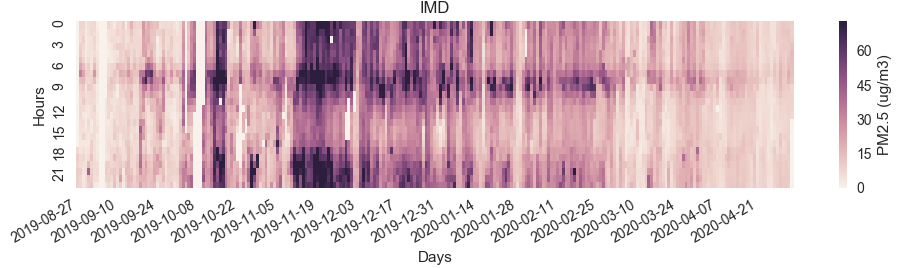
So what does pollution data look like when plotted over time? Here’s a heatmap of one of our devices (one at IMD, Shivajinagar) which has the maximum consistency of data.
PM2.5 @ IMD, Shivajinagar, Pune
The darker the region, the more the pollution. Here are some obvious patterns:
Mid-December 2019 was a general high pollution period.
In the time-band from 6AM to 9AM, there is a general trend of high pollution, consistently throughout the days.
Pollution subsides post 12 noon and then rises again after 6PM!
In general it can be found that the pollution in the afternoon band is lower than the pollution post midnight.
The last three of the above are the most interesting for analysis. Why should there be a 6AM-9AM high pollution band? Well the easy answer is that this is the time where office going people begin their daily migration to work. Similarly can be said of the post 6PM peak, when people return to their homes from work. However, what about the high pollution levels beyond 9-10PM when the traffic must mostly subside? Infact, its very interesting after mid-night when there is no traffic, the pollution is still high! Similarly, its far more intriguing that in the aftenoon band, the pollution seems to just vanish away, while the traffic is normally high!
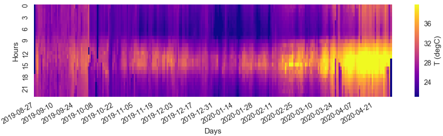
I could not get hold of how traffic flows in Pune, a temporal distribution of that could have helped. Sumithra and i were discussing this when the first plots emerged from Sumithra’s work – that there must be a temperature component involved in the pattern we see. So to explore this angle, here’s a ambient temperature temporal plot, generalized from data gathered over the 5 locations we have the Breathe2s in.
Ambient T @ IMD, Shivajinagar, Pune
It seems apparent that when the T is low before 6AM in plot 2, the pollution registers higher in plot 1.
From 6AM-9AM, the traffic adds to the existing ambient pollution and bumps up the pollution levels significantly as seen in plot 1.
Beyond 9AM, although traffic is still higher and more thicker, the temperatures also begin to rise up as seen by the yellows around 9AM-12 noon band.
Thereafter, post 12noon, more heat is added to the atmosphere giving rise to convective currents that must be driving the pollutants higher into the atmosphere and therefore we don’t register it. All this even while pollution is being generated by the traffic.
As the evening sets in, the temperatures decrease and so the pollution reporting increases. There could be 2 ways to look about it:
Do the pollutants that were elevated in altitude by the high temperatures, assuming they were not displaced by winds, come down?
OR the more likely case that the new pollutants released by vehicular traffic during the peak work-to home rush hours begin to accumulate under the denser and cooler atmosphere.
Conclusion – It seems that lower temperatures are worse in terms of pollutant density than higher temperatures.
There are definitely more facets to this data pattern and it seems we have only scratched the surface. it would have been nice to have gotten traffic data to help us understand better what and how much ambient conditions contribute.
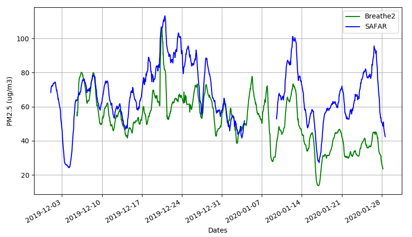
Well, luckily we had one of the Breathe2 devices placed near a government device, called SAFAR, at Maharashtra Institute of Technology (MIT) in Kothrud, Pune sometime in Dec 2019. All thanks to Dinah, Saurav and Kaushik of SCCNHub , an environmental education company and Prof Krishna Warade of MIT-WPU .
We were also lucky to be supplied by data from the government device by the MIT college students. Here’s what the comparison looks like for months Dec2019 and Jan2020.
We have some places where there are huge variations between the 2 datasets and some where there’s good compliance. Here are some reasons i could think of as to the variations:
The devices are like 300-400 meters apart. The Safar is on the road, open on all sides, while the Breathe 2 is on a building window with only front side open.
SAFAR’s sampling may be very significant so it takes in a lot of air and hence may be more closer to average pollution. Ours is but a small fan that does the sampling.
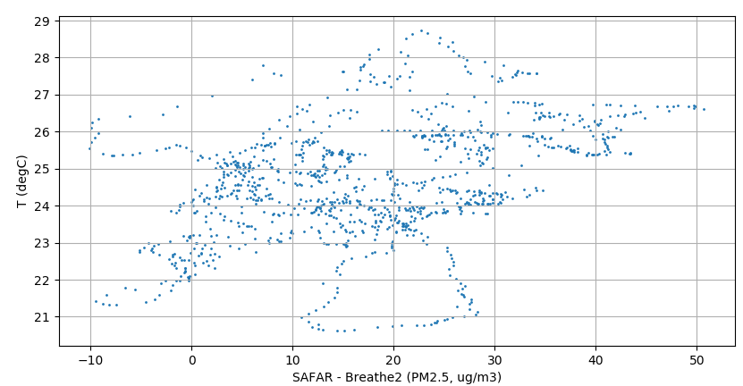
I suspect ambient temperature also plays a role probably: here x-axis is the difference between 2 devices and y is the ambient T. The lower the T the more in agreement these devices are. Higher T = more randomness and variations. As below:
I also compared with RH and P but no conclusive trend could be found with the variation in the datasets. Also since we are averaging over 24h, what we are seeing here is definitely closer to ambient pollution than localized sporadic hotspot emissions (like vehicular traffic). Wind and openness may be playing significant roles. Maybe we should look over all the data rather than the 24h average to see other clues to the variations.
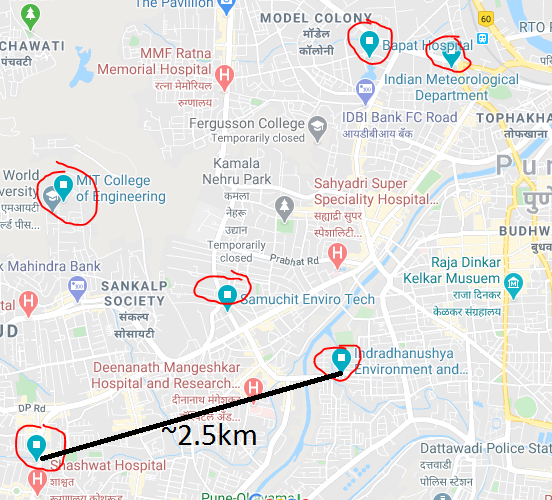
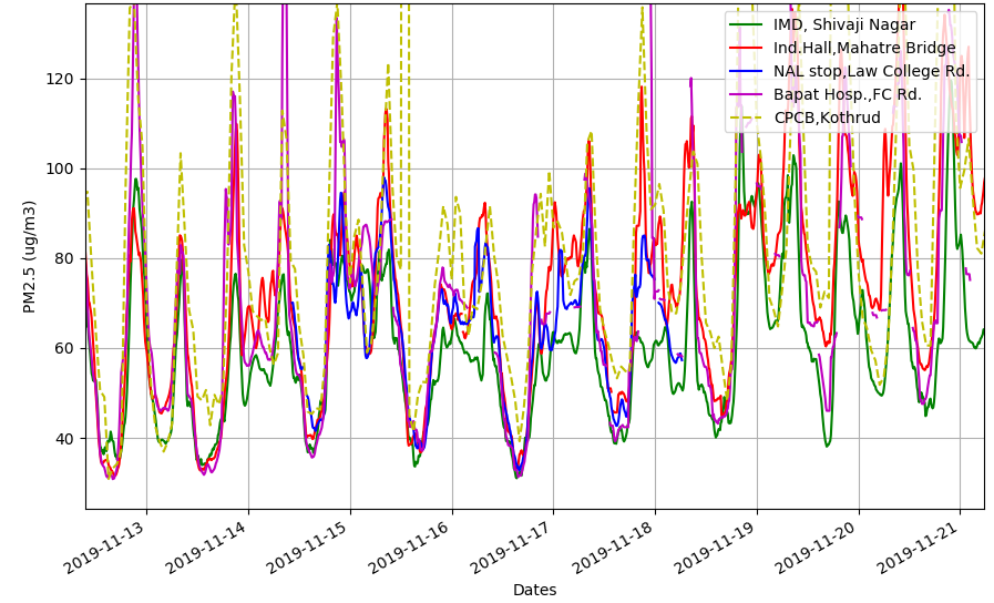
City wide comparison with CPCB data
Locations of Breathe2 devices and CPCB device (left-bottom end of black line).
Central Pollution Control Board has a setup in Kothrud, Pune (details). After endless search to find out where this setup is, i gave up. This device is about 3-4km from Indradhanushya hall, but that’s the closest we’v got. Ideally it would have been nice to setup one of our Breathe2 devices right next to this location. The location as per CPCB website is right on top of a small building on a busy road. But there is no placard, no indications on the building itself whenever i have been there. No one around knows anything remotely related to pollution monitoring device or of any government office anywhere nearby. In all possibility its a fake location, but why should i take such a huge tangent!
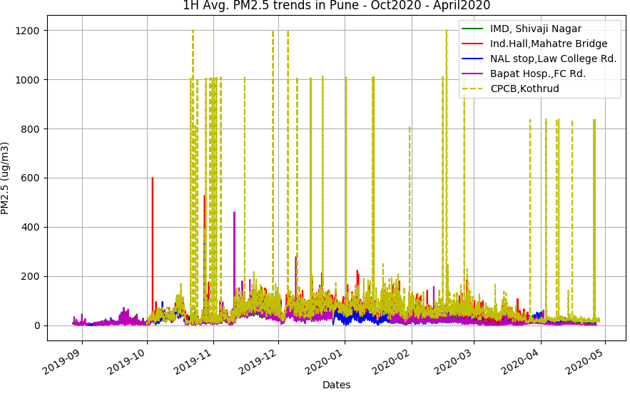
The good part is that as compared to SAFAR, the data of whose was extremely hard to get despite it being public funded device, the CPCB has its data easily accessible from its web service. And this data is downloadable in averages of 15 minutes to days and one can download it as back in history as one has the patience. The make the last point because the website’s interface is archaic and not user friendly – just like government websites should be. Anwyays, i could download the data from October 2019 to today 28th April 2020. When plotted against all data from Breathe2 devices, this is what we get.
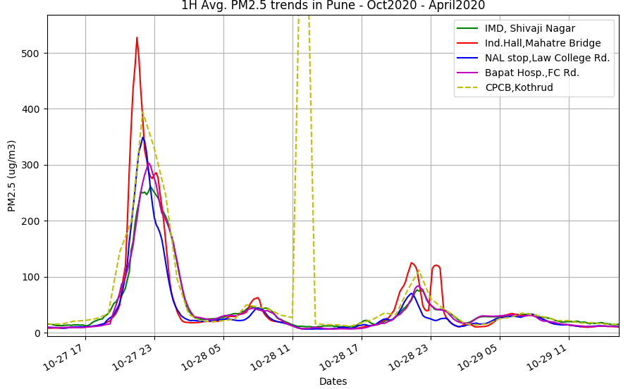
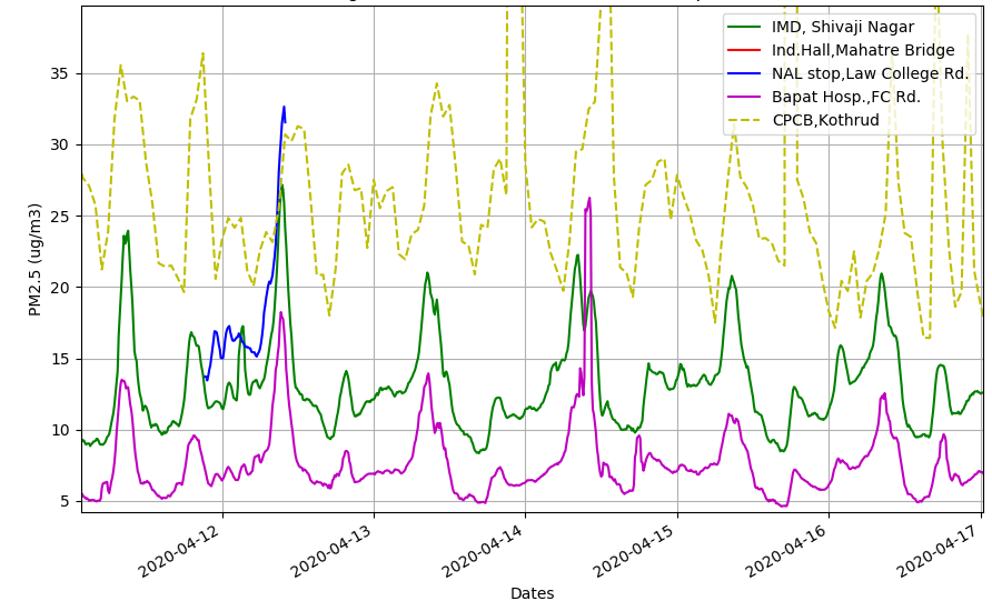
First thing to notice is that the CPCB records huge spikes of pollution that none of the Breathe2 does. But does it do for the Diwali of 2019 (27th Oct 2019) when all Breathe2s recorded high values?
Diwali across all Breathe2 devices + CPCB’s.
CPCB values are matching ours during Diwali, great! Also note that other times values also match ours very well, although we are kilometers apart! Similar matching can be found in other times too.
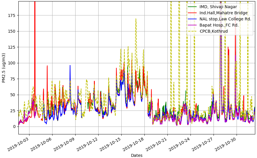
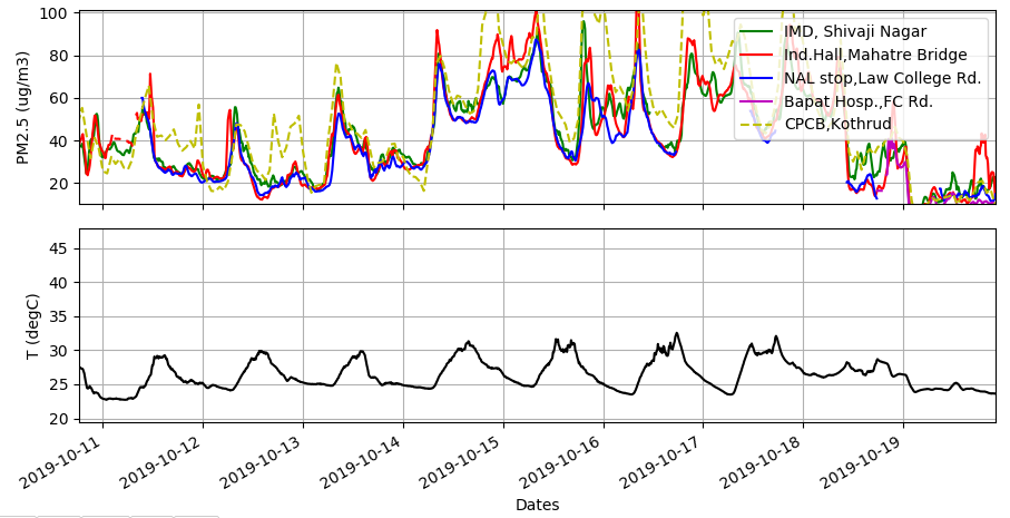
October data. Trends seem to match!Some more confirmation that Breathe2 devices are not too bad.
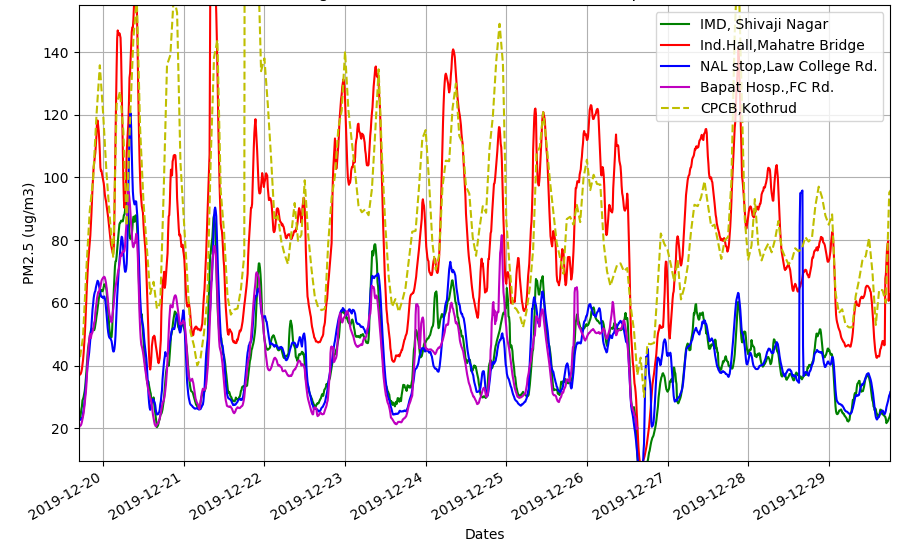
As seen above, the trends match between the active Breathe2 devices as well as with respect to the CPCB data. However, this was more or less the condition till Dec19-Jan20. Thereafter the CPCB reports much higher values than Breathe2, and as a general trend the gap widens.
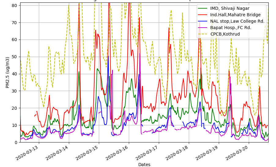
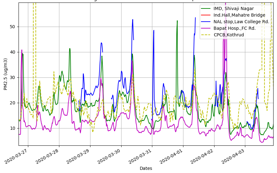
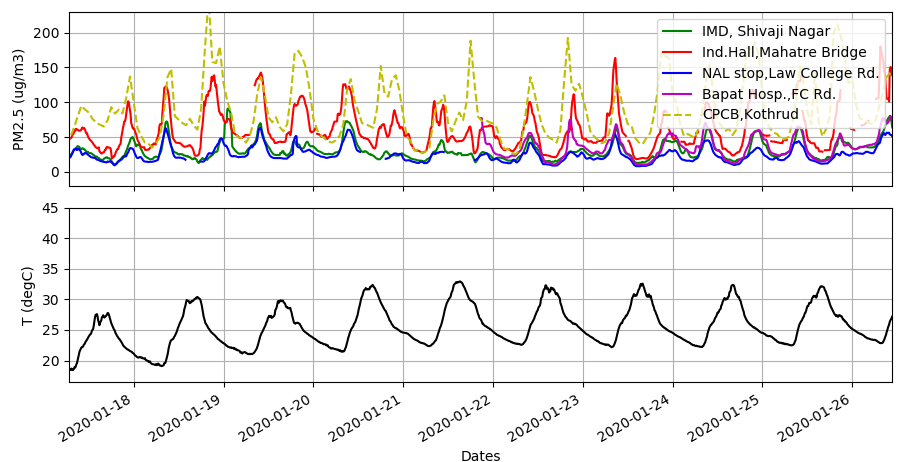
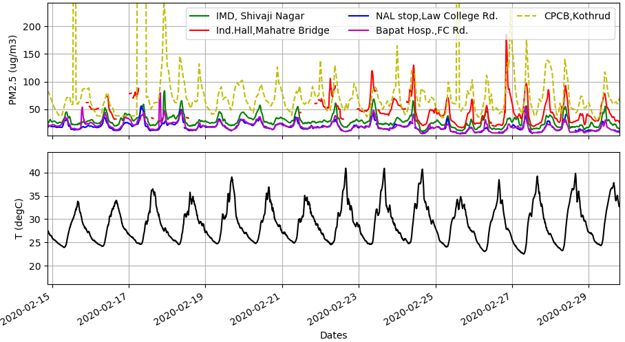
Discrepancies increase between general CPCB data and Breathe. Dec-end 2019 data.Again differing trends. Mid-March 2020 data.But March-end is great! All within reasonable differences.And again huge differences! Mid April 2020 data.
So we see in the above plots, at times there is good compliance. On other times the difference is very clear. Here are some possible reasons:
Breathe2 sampling is far weaker than those used in government devices. This may lead to that we sample mostly a small dead space around the device. But this will only explain delay in long term trends that would be picked super fast by CPCB and SAFAR types.
Breathe2 devices have sampling fans and these may have gone kaput because thats the only thing that really moves in the package. In that case however mid-March should data should have continued to be distant from the remaining devices.
This difference might be genuine as these devices are located 4-5km apart. But i dont think this is a good possibility. We have seen similar matches and mis-matches with SAFAR data too in the first plot.
One thing is that as temperatures rise, turbulence in the air increases. Winds may also be impacting the sampling. And so may relative humidity. In case of proper devices, all these conditions are recorder and accounted for, atleast T and RH. In our case we’v left it to god.
Impact of ambient conditions on difference between CPCB and Breathe2
Luckily we are measuring temperatures with each Breathe2 device. The CPCB temperatures seem to be missing!!! Anyways, i had a hunch that if temperatures increase, the compliance between different devices separated by distance will keep reducing, because higher temperatures may lead to local convection currents, vastly influencing the dumping / sinking of pollutants in the surrounding atmosphere. And since the thermal energy for convective currents will be highly variable as per local geography and surface characteristics (roads will be hotter, buildings will store heat, trees will not store much and if device is placed in shady zone this might add another effect, etc) it will be harder and harder to compare devices far apart.
So i added a temperature subplot to see the impact –
Colder times = Good agreement
This first plot above says a lot. When temperatures are lower, there is good match between the devices. The colder times also see increased pollution levels, mostly due to inversion layer concepts. The daily difference between higher and lower temperatures is hardly 5 degrees.
Difference begin to appear with hotter conditions.
But as the year progresses towards summer, temperatures being to rise and the daily temperature differences also increase from the previous 5 degC to about 10 deg C. As a consequence we can see the dotted yellow line seperating from the closest Breathe2 device at Indradhanushya Hall (red line).
Vast differences. Not comparable in magnitudes.
Here’s where the magnitudes of CPCB devices very clearly do not match with Indradhanush Hall (red) because the temperatures are now peaking quite a lot! Daily temperature swing is about 15 degrees!
So all this analysis points to a simple observation – more the temperature swings in a day, more uncomparable are distantly placed pressure monitors. Also these devices are not near, atleast 2-3 km away. Normally when they do comparisons between devices in the research papers i have come across, all devices are placed very near each other, mostly on 1 building top away from the streets. And elevated high above the ground to avoid spurious signals. We didn’t have the luxury of either.
However, why should Breathe2 devices consistently record lower pollution levels than CPCB? We have been struggling with this question since the time we got our first readings with SPS30 sensors. I suppose its because as temperatures increase, the SPS30’s assumptions go a bit off. Whereas in case of all reference instruments, they pre-condition air that is sampled so that environmental difference do not affect the readings. We should do that with Breathe3.
Sample large volumes of air with bigger fans.
Condition the temperature so that SPS30 or any sensor measures an air sample around say 25 +/- 5 degC only.
Also since RH affects particulate loading, we need to remove moisture and make dry air as the samples.
So a chiller and post-chiller heater seems to be required. Costs, well lets see.
All these are not very scientific, the reason being we don’t have the bandwidth as well as experimental facilities or experience to make better guesses. Yet i feel we are on good tracks and Breathe3 will make a better public instrument.
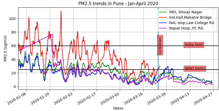
So, here we are. About a month into a national lockdown. Obviously the pollution levels (some say humans are responsible) have come down.
The data above is averaged over 24 hours for 4 devices placed at different public localities in Pune. We have had various time periods of data, and these differing time periods correspond to installation variations, availability of network, power grid supply issues and occasional switching off of devices by innocent humans walking around. For example, we can see in the above plot that just into the lockdown the Indradhanushya Hall device goes off, because its a government building. They must have shut off the whole building!
It is very interesting to observe that all the stations are having similar highs and lows, implying that the 24H averages really captures the city’s ambient conditions well. In general we can also observe that the overall trend is of lower pollution from the colder beginning of the year approaching summer like conditions now. Maybe the increasing temperatures dump much of the pollutants into upper atmospheres? Don’t know.
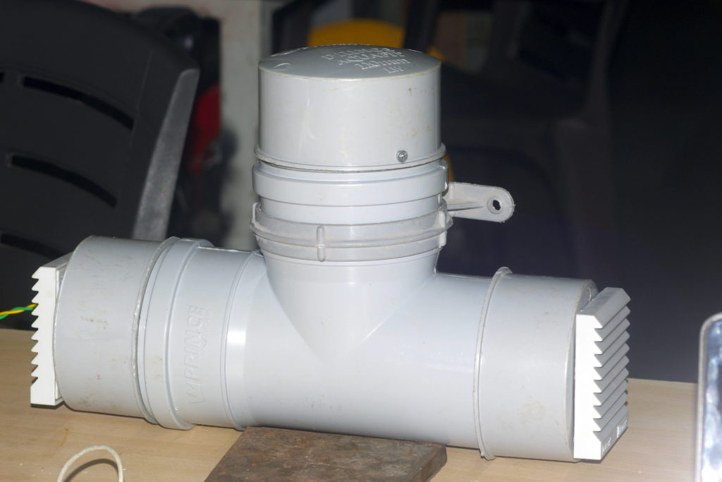
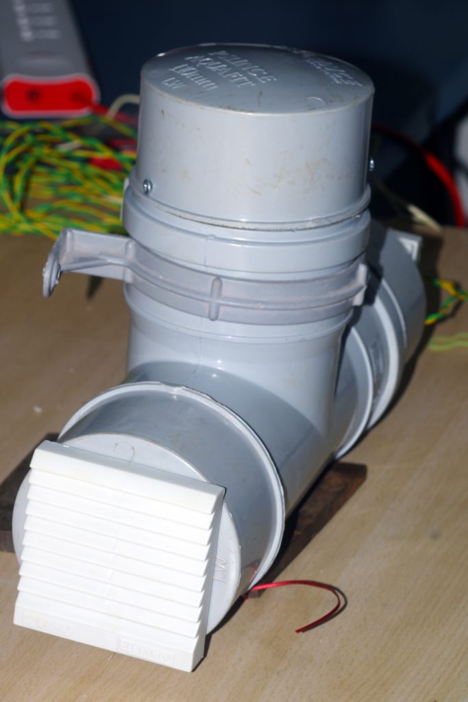
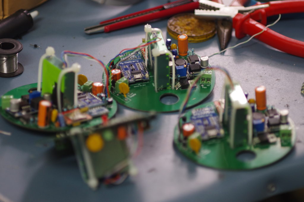
We’v been working on the Breathe2 air pollution (PM) devices for more than a year now. The status so far is there are 5 working devices spread over Pune, continuously (almost) pumping Particulate Matter (PM) data online ever 5-10 minutes from the beginning of October 2019. These devices contain a PM sensor, a relative humidity and temperature sensor, a SIM module using 2G network to communicate with the internet and a microcontroller to manage all, all in a plastic housing with a fan inbuilt for continuous air circulation.
As an assessment of that work, one thing is sure – we have built ourselves a reliable platform that has been working almost without hitches so long 🙂 And all things look OK on the surface except we don’t have answers to the following questions:
Do the devices perform as well as reputed but costlier government devices?
What patterns can we observe as to how those spots (where the devices have been operating) behave over the past months?
Are there any inter-connects between the sensors? Can these devices be taken as indicating of how an overall city breathes over time?
Even if we pursue and get some reasonable clarity on the above questions and evaluations, there seems to be a whole Pandora’s box out there to be faced with. Before i move on to keeping on the table Mrs. Pandora’s questions, there were some pertinent questions asked :
What is the vision here? What are we doing? Why we did start? Where do we wish to go?What’s the vested interest inhere? It would be best to clarify as much as possible here.
Origin: Frankly the origin of the idea to get into all this was my desire to get my hands dirty making an instrument. I always dreamed of getting into scientific instruments of some kind so by some chance encounters of news articles and so on and some free time at hand, we got in. We meaning Abhijeet and myself. We were inspired by the work of the data journalism house IndiaSpend (indiaspend.com) and its director Mr. Govindraj Ethiraj. They had pioneered the low-cost air-pollution networked system in Delhi in 2015. The team expanded and changed over time, and i write all this on behalf of the team – Abhijeet, Sumithra and subir (me) with Mayuresh pitching in at times. This is a collaborative effort between distributed individuals, i being nearest to the ground zero and the one holding the pen (or better known now a days as the ‘keyboard’).
Vision: In gist To make a low-cost opensource platform for measuring air pollution in a distributed networked format.
Vested interest: Very important question and that which every technologist must answer! But here i am speaking mostly for myself, my team-mates’ views may overlap or differ from these –
Agenda #1 – Have fun making things.
Agenda #2 – Have some meaningful fun, i mean who doesn’t want to be of some use to the society?
Agenda #3 – Get social credits, i.e. get chance to earn/raise in socially attributed personal-value (Should i have shame for harboring this most dreadful of the weaknesses ?).
Agenda #4 – Meet like minded people and work together ! How else would i have the chance to engage with so many interesting and valuable friends, beginning from my teammates ?
Some may argue that since air pollution is a new big thing with the new big fad of environmental awareness and sensors coming in cheap/easy = big market and all that, i may be having a hidden agenda / pursuit to make some nice money out of a sorry social crisis. I wish i had the brains to do so. To them i beg that they pray to their gods to gift me some business sense, so that i may at the least save some money, if not make it!
But why (seriously technical Q)? Coming back to the basics, i repeat here what Sumithra and i wrote for a research project proposal:
Government sensors are the best but too costly for commoners to buy.
Being too costly they are sparsely located.
The data they output to the public may not be scientifically analyzable by the public and who wants to get into a government department and fight it out to get tax payer’s rightful access? Not me!
Air pollution being highly local phenomena with multiple factors such as wind speed and direction, location of pollution sources in the vicinity or away from the sensor, geography (low/high altitude), weather conditions of wind/rain/humidity..etc etc all affecting in unison, it would be hard to determine how representative of the local region the government devices are. The alternative is to average out in time, but then the outcomes become huge averages that loose out on local day/time patterns!
Enter low-cost sensors and especially the idea of making an opensource platform using these sensors. Advantages:
Can be deployed in 100s if not in 1000s. Each city could have a regular grid placed sensors to get local trends (High spacial resolution).
Due to increased device density, huge 24h averages need not be the limits of data as in the case of sparse government sensors. Fine granularity could be achieved (High temporal resolution).
Data can be made available to public in raw and processed form for sections of public – local, state, national and international- to scientifically analyze data for any understanding, without asking for permissions.
Since the opensource platform essentially needs to be crowd-funded, people’s participation could get a boost and so could awareness. More, diverse and better device designs and strategies can evolve, overcoming by the by-design narrow interests of the government or private players.
But here are some issues with them:
They are compromised versions of good instruments. Meaning they use measurement techniques that compromise on measurement quality so as to reduce the costs.
There is some resemblance to what proper and best instruments would measure, but there is no guarantee of this.
Any scientific measurement instrument requires regular calibrations. That is not affordable for these sensors because of the idea behind using such sensors – keeping costs low.
Their inner workings are protected by the manufacturers and one can almost treat them as blackboxes. This could change if the sensor design itself is opensourced.
These sensors are meant to function reliably at known conditions specified by the manufacturers, but ambient air conditions continuously change, changing the performance of the sensors. There is no control over this significant aspect of this low-cost sensor domain.
So what should be ideal air pollution monitoring device? In my limited experience here are some notes:
An opensource air pollution basic sensor that clearly and transparently exposes the algorithms it uses, the assumptions it makes and the reasons behind these descisions – so that these fundamentals may be improved upon and also that these could help in proper interpretation of data.
There are many pollutants – PM2.5, PM10, CO, CO2, NOx, SO2, O3 and VOCs. All must be measured since we all now live in semi-industrial settings where all these are prevalent.
There must be some form of comparing the device with standard high quality instruments, atleast in some statistical way. Say out of a batch of 100 opensource devices made, 1 is compared to a standard lab device and the resulting calibration factors are then implemented in all the 100 devices. And this is repeated at least once every year or something like that.
The air that is sampled is adequately conditioned to meet consistently a desired temperature and humidity and volume (normal/standard volume), so that all values are comparable between devices and also in time.
The data that is sent to the cloud must be retained at all costs for years to come and ensured that its free for anyone to study and quote.
The challenges in creating the above ideal device could be:
The above steps will surely increase the costs of the original simple un-calibrated, un-conditioned devices.
Its development and deployment will take much time, effort and skills leading to more chance of this being a privately funded enterprise’s product than the ideal of a publicly crowd-sourced movement.
Who’s going to do all the calibration and maintenance? Citizen engineers?
But why am i against private companies pursuing the above goals? I am not. I actually feel private companies could do the above job more sincerely and regularly because they would have to stand for it in public scrutiny if not legal scrutiny. But i have the opensource bug in me, so can’t help looking in a biased direction. Anyways, who says opensource based businesses can’t exist? See RedHat and Ubuntu/Canonical?
All the above is fine. But there are many more unanswered questions here:
Technical questions:
What to do with the data?
How to convert data into relevant information?
Can pollutant source be located with such a network? Either geographically or even in sub-species. This is called source-apportionment in air-pollution geek-o-logy.
Is there a good way to place the sensors or just randomly, and as many as possible? These devices don’t come cheap, so Sumithra proposed to study if there’s an optimal way to strategically place the sensors across a city and also monitor using sensors on criss-crossing city vehicles.
Social questions:
Relevant to whom? Who would want to get this data anyway? (Thanks Abhijeet for asking and maintaining this question).
If we are not doing all this for end-of-day measurement of medical impact of pollution then what’s the point. And how to measure this impact? Is there any way at all thanks to the huge privacy barrier in the medical industry? (Maybe in collaboration with Aditi Dimri’s/Rasika Lokhande’s health monitoring work?)
Can this data be used by advocacy groups with pressure government to act? Will the government not question the data’s lack of calibration? (example is the HIRWA group which successfully pressured local administration to act against waste burning using such low cost air monitoring sensor data – news article link)
With power comes responsibility, which humans have a shoddy track record of. So here are some potential negative consequence in the hypothetical case when the above air pollution monitoring campaign is successful (Thanks Sumithra for thinking and opening up this topic to further thought) :
Suppose large numbers of these sensors are deployed, but only a handful of scientists working on them. What if a scientist turns rogue, and predicts doom or bliss when the actual pollution state of the city is otherwise?
Can powerful organizations (government, corporations, etc) in anyway misuse the data to subdue public interest?
Suppose a segregated city (race/religion wise) is mapped, can these sensors be misused as propaganda tool to stereotype communities ?
Along with the above, i am sure many more questions/ideas/doubts exist. I was also lucky to be a part of a general ‘open-hour’ discussion which the kind and generous PublicLabs people hosted (Thanks Stevie and team) on how different interested people all over the world think about these low-cost air pollution monitoring movement. It was held on the 2nd of March 2020. I have not had to the time to analyze many of the questions and arguments that came about 1h30m long discussion, but it was great overall! Details in the above link.
So coming back to the earth and asking what should be the immediate plan, here are some pointers –
Verify the existing 5 Breathe2 devices to get:
Compare with MIT college’s SAFAR dataset and see how they fare.
Map patterns over time for all the sensors.
Make a small report.
Work on Sumithra’s idea :- How to optimally map a city though stationary and mobile low-cost air pollution sensors?
Investigate new device platform incorporating more pollutant measurements and input air sample conditioning. (Abhijeet’s help needed here).
The broader Qs need to be dealt with as and when the brains and pockets grow.
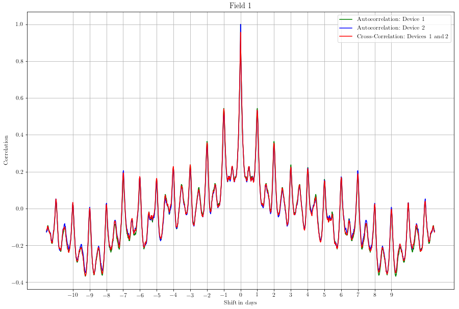
Thanks to our team-member Dr. Sumithra’s (SSLA, Pune) efforts on the python coding, analysis and in general discussions on the how/what/why of data, here is a brief analysis of the Breathe2 data generated so far.
The above is the auto-correlation of 1 device with itself as well as cross correlations between 2 Breathe2 devices, placed side by side at Shivaji Nagar’s IMD campus. Conclusions :-
Cross-correlation of 1 device to another shows that each devices is just similar to anyother Breathe2 device. That means, of a device in Antarctica (some place we’ll eventually dream to setup this – oh what fun will that be!) will be similar to a device in Mumbai in terms of data.
Auto-correlation shows that there is a pattern that repeats – in this case its for a couple of days of the week when data of 1 day, when properly overlapped by the data of another day (24h gap) shows a high correlation. This we can observe visually too, pollution rises during morning hours, falls during afternoon times and then rises again in the evenings.
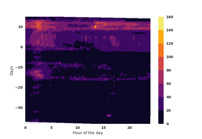
Following is a trailer of the kind of data that we are planning to generate on a regular basis. The x-axis is the hour of the day, whereas the y-axis is the running day from the start of data gathering. This could be marked in weeks, months and weekends to see how patterns emerge. The color bar on the right indicates which color in the plot corresponds to what intensity of PM2.5 emissions (ug/m3). In the following plot, the Breathe2 device firmware was upgraded on 5th October and then-on gave correct values for PM2.5. The last 10 days (today is the 20th of Oct.) seem very polluted – maybe because of the rain break!
All the data can be downloaded as a single CSV file from each channel. Here’s how:
Identify which channel you wish to analyze for which device. Each device outputs 3 channels
Mass concentrations of – PM1, PM2.5, PM4 and PM10
Number concentrations of – PM0.5, PM1, PM2.5, PM4 and PM10
Ambient conditions – Relative Humidity (%), temperature (deg. C), and pressure (Pa)
The channel number is the one at top left corner of the page (which opens when you click any of the mass, number and ambient conditions links) by name of “Channel ID”.
Copy and paste the following command on any internet browser, and replace the <channel_ID> with the channel id you recovered from step 2 –
After much testing and getting abysmally low values (for once i wanted more pollution!!) on the plots we have cleared some design flaws, which can be simplified here:
Current flow to SPS30 could have been lower than expected. So upgraded a capacitor in the path to 1000uF from 470uF.
Upgraded firmware library from Paulva‘s fantastic one (sorry Paul) to Sensirion’s recommended one with hopes of being in compliance with the company and then checking if all works better. Didn’t help much though!
Thanks to my colleague Dr. Sumithra’s (SSLA, Pune) help, upgraded sampling and reporting method from median to average, and soon will shift over to mode.
It is recommended that find dust samplers must 16.67 L/min of flow rate past the sensors to ensure high sensitivity. I could not measure, but i added a powerful 12VDC fan (0.6 A) to the system to emulate that effect.
So the outcome is better due to the above steps. How good and how close to actual, we can only test that with a calibrated instrument and i don’t know how we will get there.
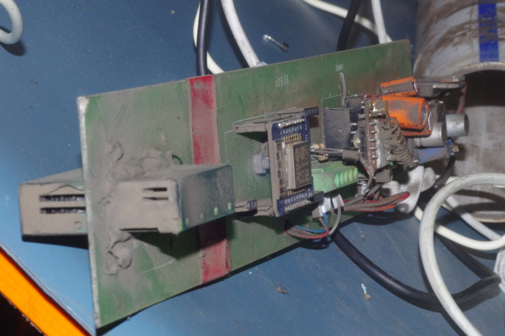
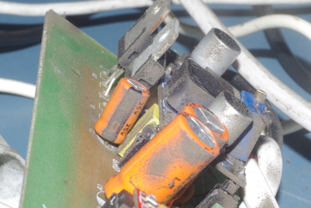
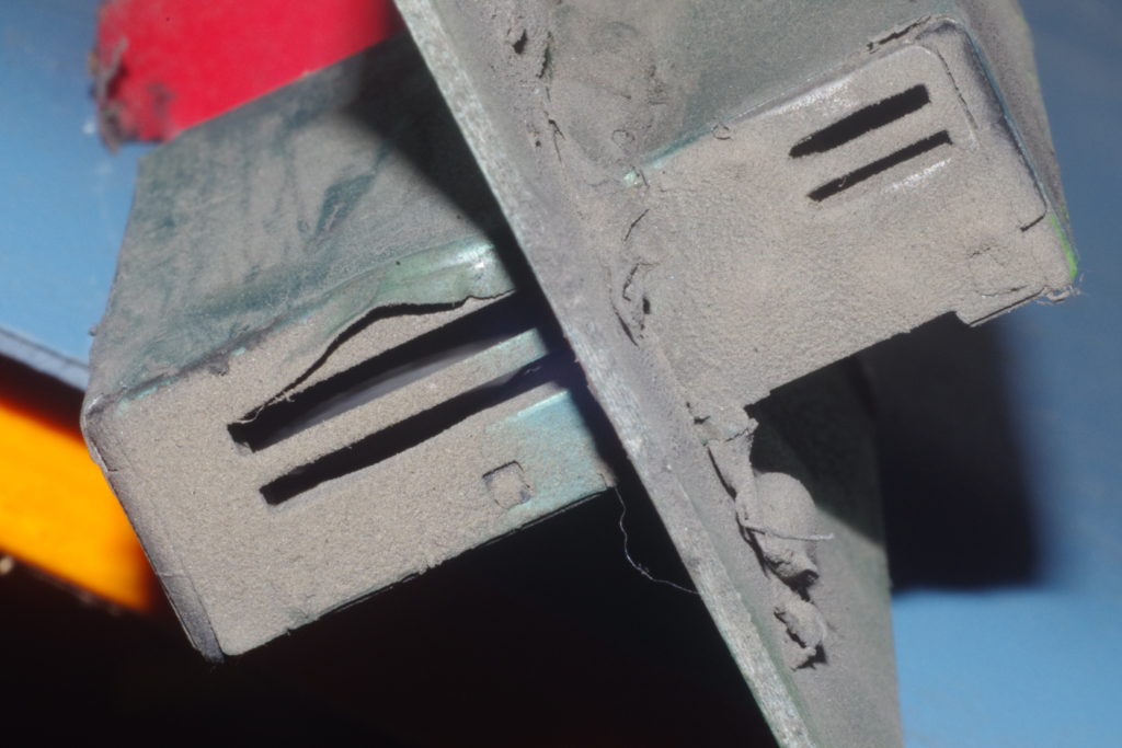
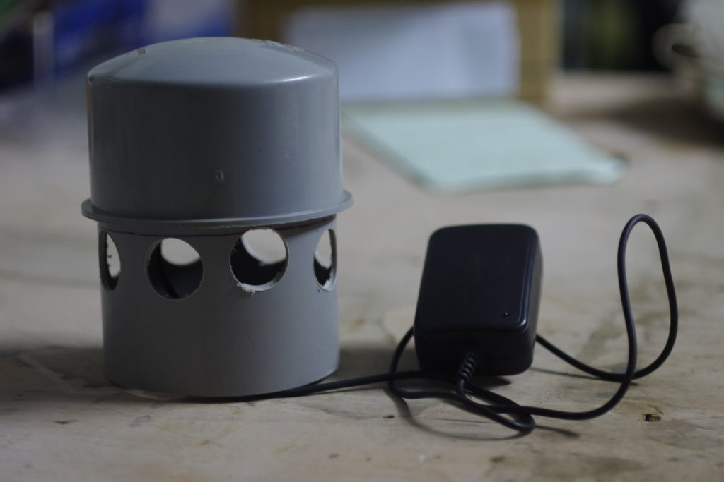
Here are some pictures.
And the data can be seen here – https://thingspeak.com/channels/841841
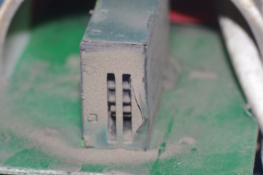
After months of exposure to Shivajinagar’s traffic and running on a 12V fan 24×7 (or whenever the mood was not bad), here’s the dust settlement on the original version’s innards.
Intake and exit points of the SPS30 PM sensor.
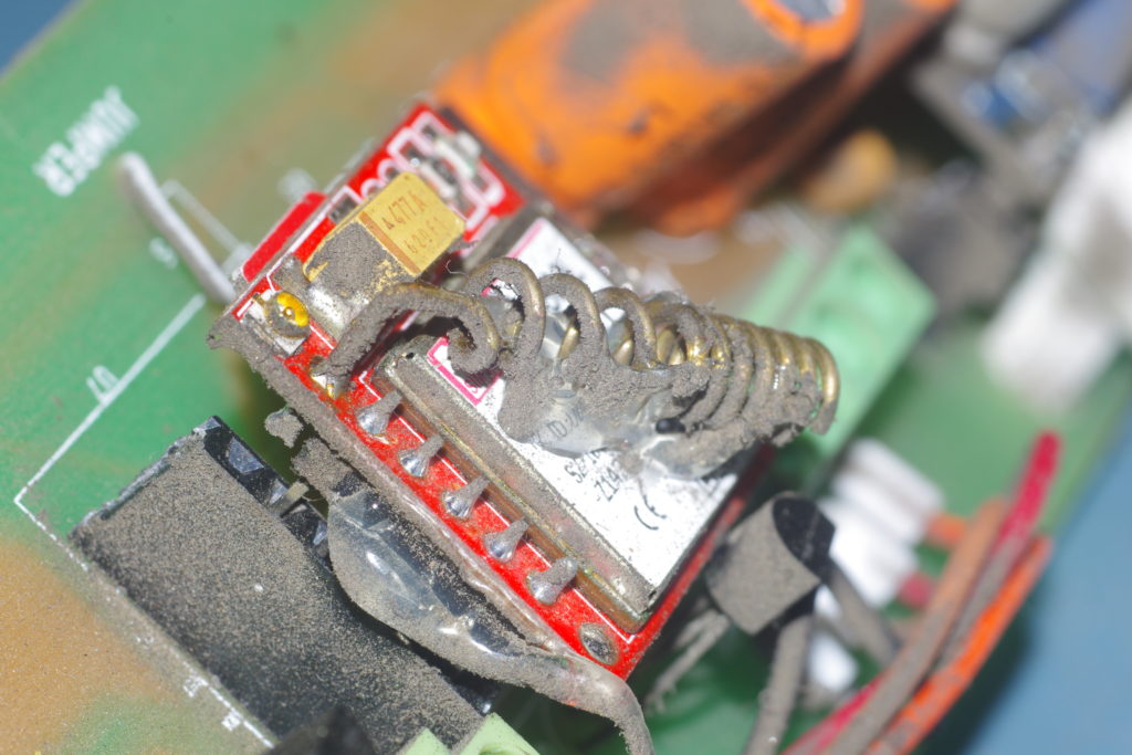
Dust on SIM800 module which is way at the end of the air path.
All over the board there’s dust.
Another view of the dust on the SPS30 sensor.
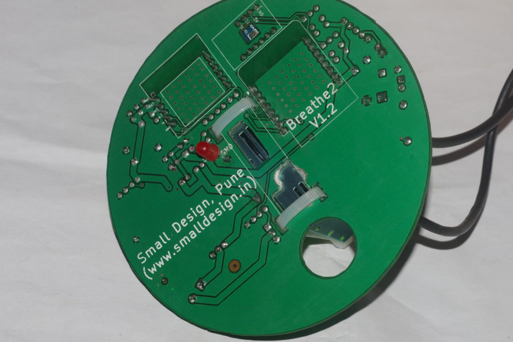
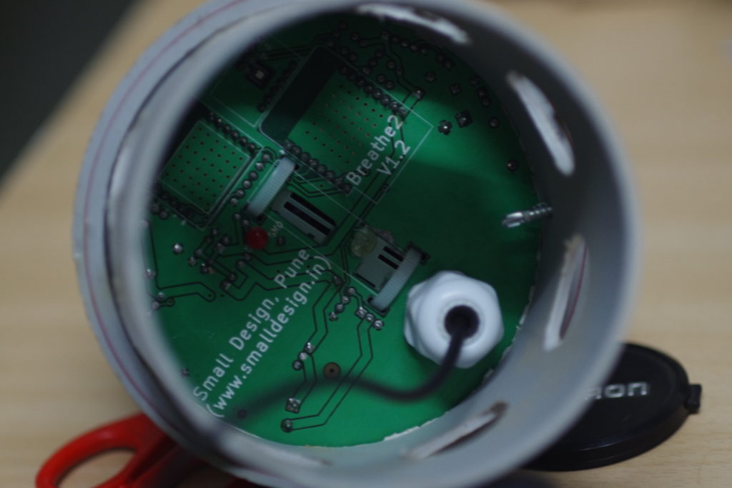
So it proves that this design is bad at the fundamental level. This amount of dust, and expected condensation will definitely cause some shorting someday. The newest design Breathe2 V1.2 bypasses this condition by shielding the external environment from the components. Only the underside of the PCB (where there are no components except a LED) is exposed.
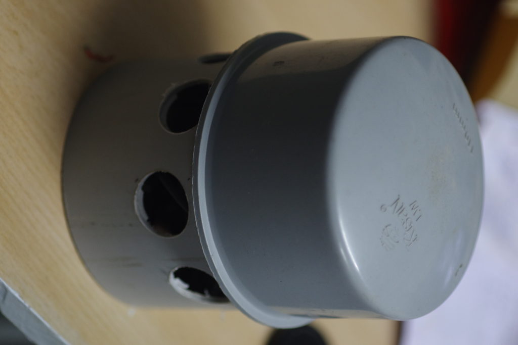
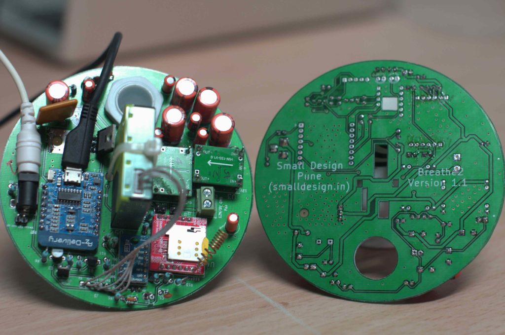
V1.1 was designed to fit into a cap of a PVC pipe and all this held upside down so that the cap is on top. The gaps in the PCB would allow the air sensor to get fresh air and so on. The PCB would have a dual task as a PCB and of keeping the components mounted on it from being exposed to external weather conditions.
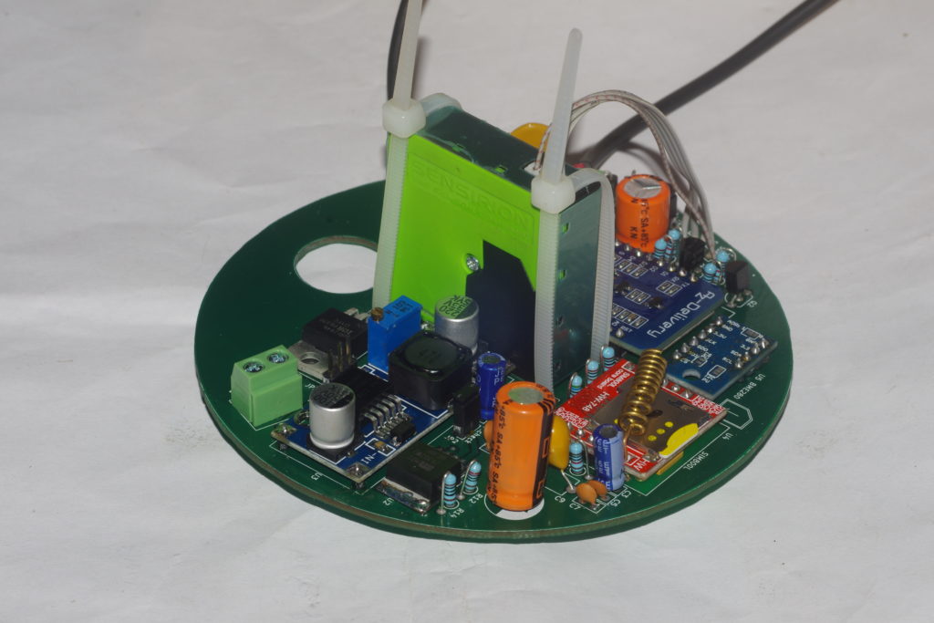
A populated V1.1 board and its bottom with our name and version.
However, the biggest mistake (Subir’s) was the selection of the power supplies MP1584 (see the 5V written by hand on the left disc) which ran hot within a few minutes leading to resetting of the boards.
10 PCBs were made, some were populated, but due to the fundamental problem of power supply, all this had to be scrapped.