So what does pollution data look like when plotted over time? Here’s a heatmap of one of our devices (one at IMD, Shivajinagar) which has the maximum consistency of data.
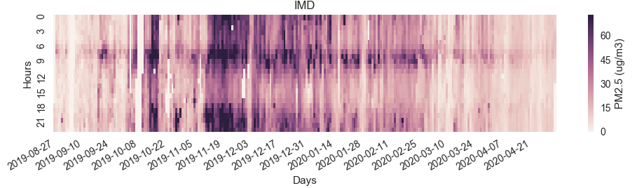
The darker the region, the more the pollution. Here are some obvious patterns:
- Mid-December 2019 was a general high pollution period.
- In the time-band from 6AM to 9AM, there is a general trend of high pollution, consistently throughout the days.
- Pollution subsides post 12 noon and then rises again after 6PM!
- In general it can be found that the pollution in the afternoon band is lower than the pollution post midnight.
The last three of the above are the most interesting for analysis. Why should there be a 6AM-9AM high pollution band? Well the easy answer is that this is the time where office going people begin their daily migration to work. Similarly can be said of the post 6PM peak, when people return to their homes from work. However, what about the high pollution levels beyond 9-10PM when the traffic must mostly subside? Infact, its very interesting after mid-night when there is no traffic, the pollution is still high! Similarly, its far more intriguing that in the aftenoon band, the pollution seems to just vanish away, while the traffic is normally high!
I could not get hold of how traffic flows in Pune, a temporal distribution of that could have helped. Sumithra and i were discussing this when the first plots emerged from Sumithra’s work – that there must be a temperature component involved in the pattern we see. So to explore this angle, here’s a ambient temperature temporal plot, generalized from data gathered over the 5 locations we have the Breathe2s in.
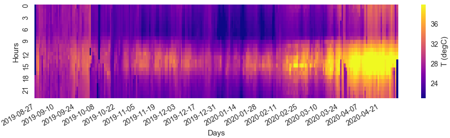
- It seems apparent that when the T is low before 6AM in plot 2, the pollution registers higher in plot 1.
- From 6AM-9AM, the traffic adds to the existing ambient pollution and bumps up the pollution levels significantly as seen in plot 1.
- Beyond 9AM, although traffic is still higher and more thicker, the temperatures also begin to rise up as seen by the yellows around 9AM-12 noon band.
- Thereafter, post 12noon, more heat is added to the atmosphere giving rise to convective currents that must be driving the pollutants higher into the atmosphere and therefore we don’t register it. All this even while pollution is being generated by the traffic.
- As the evening sets in, the temperatures decrease and so the pollution reporting increases. There could be 2 ways to look about it:
- Do the pollutants that were elevated in altitude by the high temperatures, assuming they were not displaced by winds, come down?
- OR the more likely case that the new pollutants released by vehicular traffic during the peak work-to home rush hours begin to accumulate under the denser and cooler atmosphere.
Conclusion – It seems that lower temperatures are worse in terms of pollutant density than higher temperatures.
There are definitely more facets to this data pattern and it seems we have only scratched the surface. it would have been nice to have gotten traffic data to help us understand better what and how much ambient conditions contribute.