Thanks to our team-member Dr. Sumithra’s (SSLA, Pune) efforts on the python coding, analysis and in general discussions on the how/what/why of data, here is a brief analysis of the Breathe2 data generated so far.
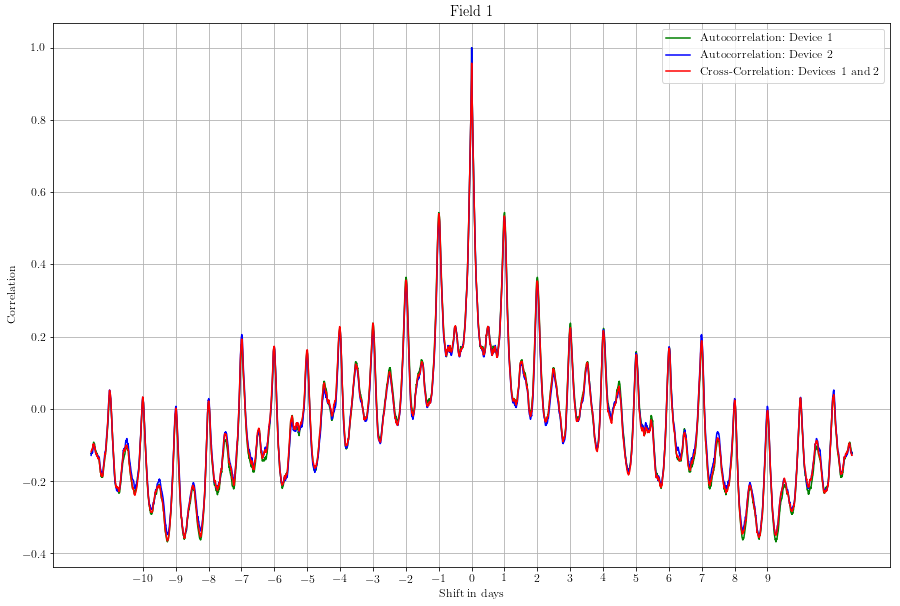
The above is the auto-correlation of 1 device with itself as well as cross correlations between 2 Breathe2 devices, placed side by side at Shivaji Nagar’s IMD campus. Conclusions :-
- Cross-correlation of 1 device to another shows that each devices is just similar to anyother Breathe2 device. That means, of a device in Antarctica (some place we’ll eventually dream to setup this – oh what fun will that be!) will be similar to a device in Mumbai in terms of data.
- Auto-correlation shows that there is a pattern that repeats – in this case its for a couple of days of the week when data of 1 day, when properly overlapped by the data of another day (24h gap) shows a high correlation. This we can observe visually too, pollution rises during morning hours, falls during afternoon times and then rises again in the evenings.
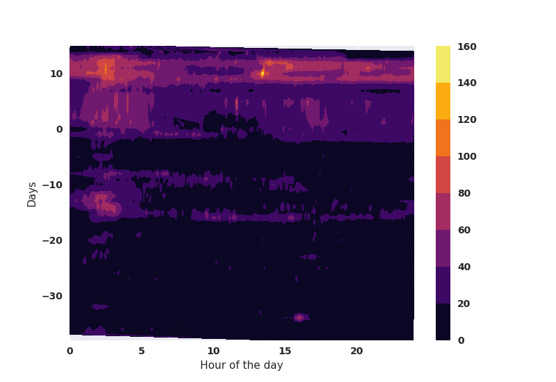
Following is a trailer of the kind of data that we are planning to generate on a regular basis. The x-axis is the hour of the day, whereas the y-axis is the running day from the start of data gathering. This could be marked in weeks, months and weekends to see how patterns emerge. The color bar on the right indicates which color in the plot corresponds to what intensity of PM2.5 emissions (ug/m3). In the following plot, the Breathe2 device firmware was upgraded on 5th October and then-on gave correct values for PM2.5. The last 10 days (today is the 20th of Oct.) seem very polluted – maybe because of the rain break!