As seen in the previous posts (What is math to us? and What is a function?), math is relevant and practical, at the least. It is the means through which humans can comprehend the world in a definite manner, with more and more evolving ability to objectify and count complicated phenomena. But as a student of math, how can we act on math, like in day-to-day terms? I suppose the overall scheme is:
- Observe and count
- Make good tables with one to one or sequential coorelations between various parameters which were counted/observed/measured.
- Plot the numbers in various graphs.
- Transform the number tables through known mathematical manipulations to form better graphs so that we head towards relating the unknown to the knowns.
- Strive toward the ‘equation form’ of representation, which can link the known and the unknowns through a simple textual code – the model.
- Use the ‘model’, to test the model and fine-tune, specify regions where the model works and where it doesn’t.
- Next, use the well tamed model to extrapolate the future or link up with other models.
- Use this model as a potential modular component, a brick to build a conceptual house so to say, to understand the next new phenomena and repeating again all the previous steps.

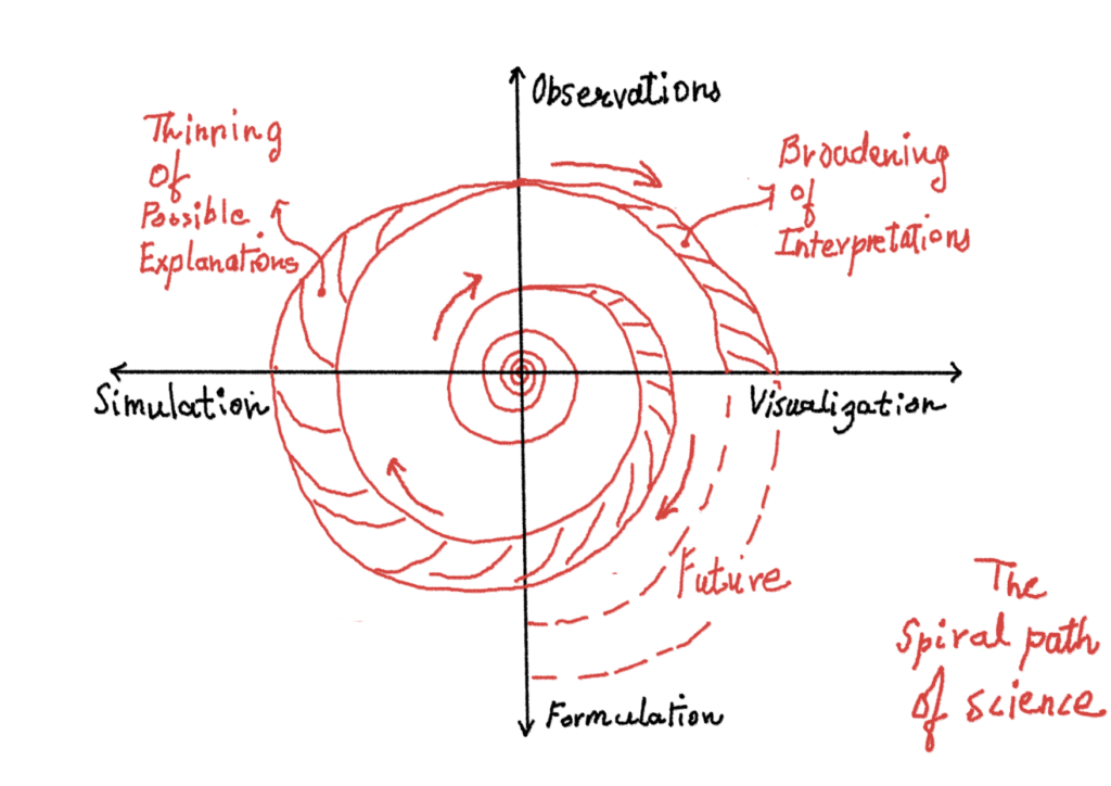
The list above could be represented by an illustration as a spiral path of science. Here one begins by observations and makes multiple interpretations of it. Some of these interpretations form various kinds of ‘interesting’ graphs and also include some manipulation of the observed data to form different and more revealing graphs (Visualization). These graphs are then broken and tamed with graphs of known functions and eventually a textual formula or model is formed (formulation). These sets of models are used to create simulated replicas of the real phenomenon and then compared with the reality (Simulation). The broadening path indicates the many ideas and possible interpretations one begins with. But when one tests the simulations against reality, a lot of ideas are forced to be dropped from the realm of scientific thought as as they don’t satisfy the simulation=reality test, thus narrowing the path again culminating at the observation arm of the axes. At this stage, when the simulation becomes a well proven model, it could be used to further interpret or predict newer observations, as depicted by the increasing size of the spiral.
Why is representing data in a graph so important?
This is a good question, an i can only wonder some answers here which obviously are very naive due to the lack of sufficient thought or experience or training in the domain of mathematics. I am thinking the role of vision in our lives. The ability to sense at a distance is crucial to the survival of so many animals, including humans. With that sense-at-a-distance ability, it also needs to be good enough to interpret fast, if the remote scene is friendly or otherwise. And how do we do that? Our vision systems (sight+brain) has learnt that some patterns are good, some are bad and so in the remote scene we search for these cues. We search for patterns which are similar to what we have known so far. Our pattern seeking behavior is crucial to everything. Not all pattern knowledge is first hand. That is probably where culture, education, traditions, etc come in. But let’s not digress.
So our pattern seeking vision is kind of super trained to remove the clutter and get to sections of the scene which resemble what we have known previously through either extension/exaggeration (points depicting a line) or creative manipulation (Zodiac signs of astronomical bodies?). However, not all information is visual in nature, for example the changes in temperature over time. In fact much of the information is not instantaneous – the domain where vision works (Einstein would disagree a bit here, arguing that nothing is instantaneous. But lets escape that trap for now through a classical way.). So what graphical representation does is probably transform the significant amount of non-instantaneous information, spread over tables and tables of measured data into an instantaneous form (2D image), so that our well developed ability to figure out visual patterns within a noisy scene can come in handy.
So shouldn’t we stop here?
Why do we need algebra?
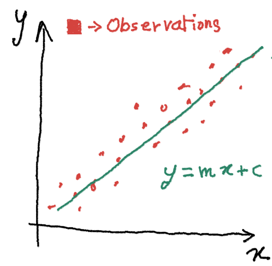
So although graphs made out of tabulated data do reveal a lot, often we are in need to transform the data to obtain more revealing graphs. Example could be a real data showing if x occurs with some magnitude, event y also occurs with some magnitude.

However, the observations always have some noise in them, like in the image above. Yet, knowing that Y is growing when X is growing, the observed data could be further simplified, by just doing compromises on the accuracy of the model and representing the reality instead by a simple equation.
Another good example of why an equation is helpful more than a graph is when using measurement instruments. A common way to measure temperature is through a RTD (Resistance Temperature Detector) the electrical resistance of which varies as temperature changes. This changing resistance can be measured through an electronic circuit and the temperature can be interpreted. But how? Often the RTD resistance to temperature curve is one measured through real experiments, where the resistance is recorded (y-axis) for an increasing temperature (x-axis). This curve is not a straight line. When using this device in real circumstances, 2 approaches can be used. The real experimental values (the table of resistance Vs temperature) for each degree change in temperature could be stored in a computer and any real resistance measurement can be checked against these values to get an accurate temperature. However this method will need a lot of digital data storage space and many operations. Another method is to convert the graph into a polynomial equation which has only one input and one output, the resistance measured and the temperature, respectively. Storing this simple equation and evaluating it in a small space constrained computer is much easier and safer. Although the polynomial does not exactly match the real measured curve, it remains suitable for most practical purposes. (More on this here).
Where to begin?
The first tools to learn is tabulation and tabular operations. What better thing invented for this purpose than the spreadsheet! The advantage of the spreadsheet is that it could be used to store tabulated data, manipulate it by transformations, graph it, and and even simulate formulae into graphs.
A good base to learn spreadsheets could this.
And a good tutorial for graphing and analyzing data here.